A working system that needed a designer's eye, not a full overhaul
Library comp. builds web applications and services for libraries across the Czech Republic, with a mission that goes beyond software: helping libraries become cultural centres that promote information literacy and lifelong learning. Their librarian-facing management system — the tool staff use to handle acquisitions, loans, returns, inter-library requests and records — worked, but its interface hadn't been touched in a long time.
This wasn't a request to rethink the system's logic. Library comp. and their developers had already decided what needed to happen: a UI redesign of the existing system. My job was narrower and more specific than a full UX overhaul: bring logical positioning, visual hierarchy, and UI best practices to screens that had grown organically over years of feature additions.
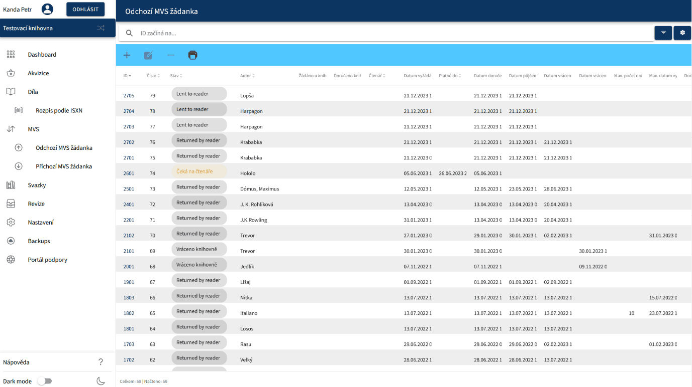
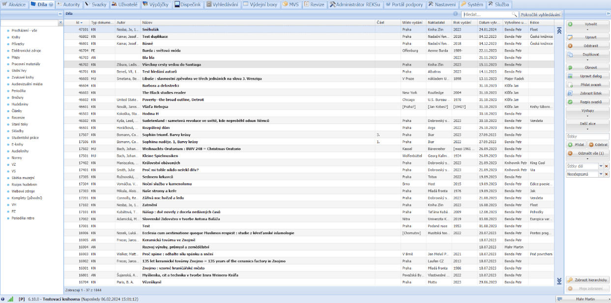
The system before redesign — dense data tables, minimal visual hierarchy
Treating documentation as research data
With a UI-scoped brief, the smartest move wasn't to commission new discovery research — it was to read everything the institution had already produced about its own system, most of which had never been looked at through a design lens before:
Treating documentation as research data is an underused move. Support teams and Confluence pages often contain a more honest picture of where users struggle than a handful of moderated interviews would, because it's built from hundreds of real support tickets and edge cases, not a small testing sample. The job here was synthesis: turning that scattered institutional knowledge into a clear, prioritised redesign brief.

Synthesising scattered documentation, support knowledge, and stakeholder input into a redesign direction
The interface told its own story
The existing interface told its own story before a single user comment was needed. The top navigation alone carried more than a dozen top-level menu items competing for equal attention — Akvizice, Díla, Autority, Svazky, Uživatelé, Výpůjčky, Dispečink, Vyhledávání, Výdejní boxy, MVS, Revize, and more — with no visual distinction between the handful of actions librarians use constantly and the rarer administrative ones. The main work area defaulted straight into a dense, unfiltered table, hundreds of records deep, with no clear entry point for "what do I need to do today."
That's a UI problem with a UX root cause: the system was organised around what the database could show, not around what a librarian's actual workday looks like.
Organise around the workday, not the database
The new design flipped that priority. Instead of opening on a flat table, the redesigned dashboard leads with what actually matters at the start of a shift: a "what's new" section surfacing pending reviews and new purchase suggestions that need attention, a favourites row for the handful of tools each staff member actually relies on day to day, and at-a-glance statistics (loan activity, service time) instead of a wall of unfiltered records.
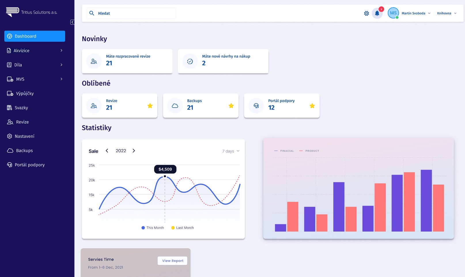
The redesigned dashboard — prioritised around daily tasks rather than raw data tables
The navigation was restructured around frequency and function rather than database structure, grouping the rare admin-only actions away from the daily-use ones, with consistent visual treatment applied across every screen so staff could predict where to find things instead of relearning the layout module by module.
Backing the redesign with something developers could actually build on
A polished set of redesigned screens isn't worth much if the team building it has to reverse-engineer the logic behind every button and spacing choice. Alongside the UI redesign itself, I built a complete, standalone design system in Figma, covering everything from foundations to fully assembled components, ready for developers to implement without guessing.
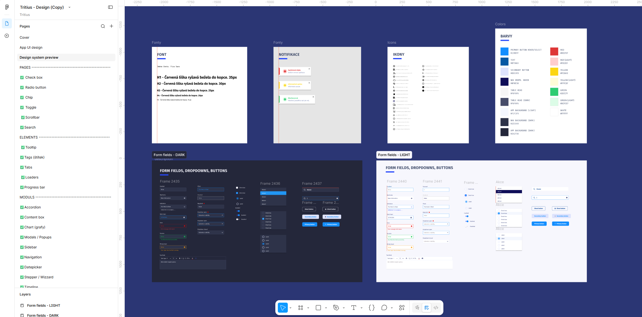
The design system built alongside the UI redesign: typography, colour tokens, icons, and form components in both light and dark themes
The system covers the foundations: a defined type scale (H1 through H5, built on a single typeface), a full colour palette with named tokens for primary and secondary actions, semantic states (success, warning, error), backgrounds and table headers, and a dedicated icon library.
On top of that sit the components themselves, documented in both light and dark themes: form fields, dropdowns, and buttons across every state a developer would actually need to handle (enabled, read-only, disabled, validation/error, success), plus checkboxes, radio buttons, chips, toggles, tooltips, tabs, accordions, modals, navigation, sidebar, datepicker, stepper, timeline, loaders, progress bars, and notification toasts. Building light and dark variants for every one of these wasn't a cosmetic flourish, it meant the client's developers had a true 1:1 reference for implementation, in whichever theme a given screen needed, without having to extrapolate or guess at the missing half.
The goal wasn't just consistency across the screens I'd already designed, it was making sure the client's developers could extend the interface on their own afterwards without reinventing a pattern every time a new screen came up.
A complete new UI direction, ready for development
This engagement shipped a complete new UI direction for the librarian panel, validated directly against the client's own documented use cases and the workshop sessions, ready to hand off into development. As a pure UI redesign project, there's no separate post-launch usage metric to report here the way there is for full end-to-end UX engagements — the value of this one shows up in day-to-day usability rather than a single headline number.
What this project reinforced
Documentation can be research, if it's good enough. A mature support knowledge base often surfaces more real usage problems than a handful of fresh interviews ever could.
A "UI-only" brief still deserves an audit. Scoping out new discovery research doesn't mean skipping a structured read of what's actually broken in the current interface.
Organise navigation around what people do, not around what the database contains. The clearest sign an interface needs work is when its structure mirrors the system architecture instead of the user's day.
Not every redesign needs a research phase to be grounded in real evidence. Sometimes the evidence is already sitting in a knowledge base, waiting for someone to read it with a designer's eye.