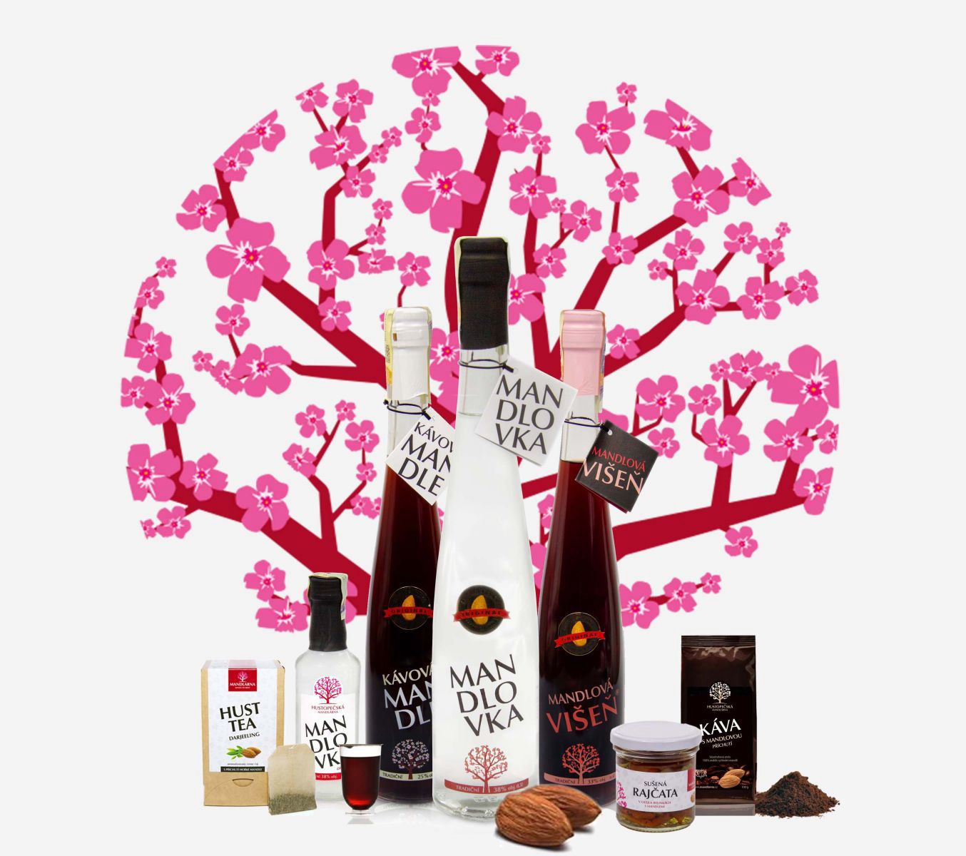
A product people already wanted, a website that couldn't sell it
Mandlárna, a spirits producer based in Hustopeče, in the heart of South Moravia's wine country, had built real demand for their product offline. Their website hadn't kept pace: it reflected neither how the business actually ran day to day, nor where they wanted to take it. Once the client signed off on a proposal that included UX research and design as part of the scope, the work could start properly.
Two specific ambitions shaped the brief from day one: a nationwide, interactive map of every place customers could buy the product in person, updated as new pickup points came online, and the option for customers to build their own gift packages by combining products, rather than choosing from fixed sets.
End-to-end UX and UI design
I led UX and UI design on this project end to end:
Reading the site before redesigning it
Before redesigning anything, the existing site got a proper audit: mapping its structure and reviewing analytics data to find out exactly where users were getting stuck. Customer surveys added a second layer, surfacing what people actually expected from a new site and a long list of suggestions worth weighing against the brief.
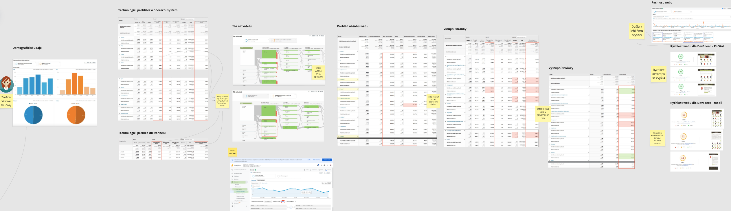
Audit of the existing site — structure mapping and analytics review
One of the more valuable sources of insight didn't come from a structured research method at all: two members of the client's own sales team, who handled customer calls and complaints daily, had a sharper read on where customers got frustrated than any survey could fully capture. Their day-to-day frustration handling unhappy customers became real input into the redesign.
To confirm everything the surveys and sales team had surfaced, we ran usability testing on the old site with 10 participants, closing the loop between what people said was wrong and what actually happened when they tried to use it.
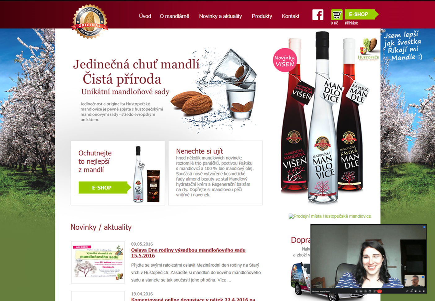
Usability testing on the old site with 10 participants
Two core features, two rounds of polish
Wireframes translated the research and the two core business requirements — the nationwide e-point map and the build-your-own gift package — into a structure the team could test and refine. Once the direction was validated, the high-fidelity UI went through two rounds of polish before final designs were mapped and handed off to the development team.
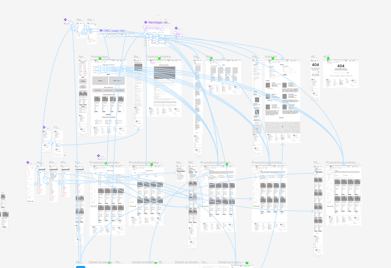
Wireframes and high-fidelity UI design — validated before development handoff
The aim throughout was straightforward to state and harder to deliver: modernise how the product was sold so the client could grow revenue, while making both online and in-store transactions easier to track on their side.
Offline demand, finally converted online
The new e-shop, backed by SEO work to drive traffic, helped turn existing offline demand into online sales. Conversion on the new site rose by roughly 75%. The interactive e-point map gave the business a second growth channel beyond direct e-commerce: a constantly expanding network of pickup points across the country, with new locations added on a weekly basis.
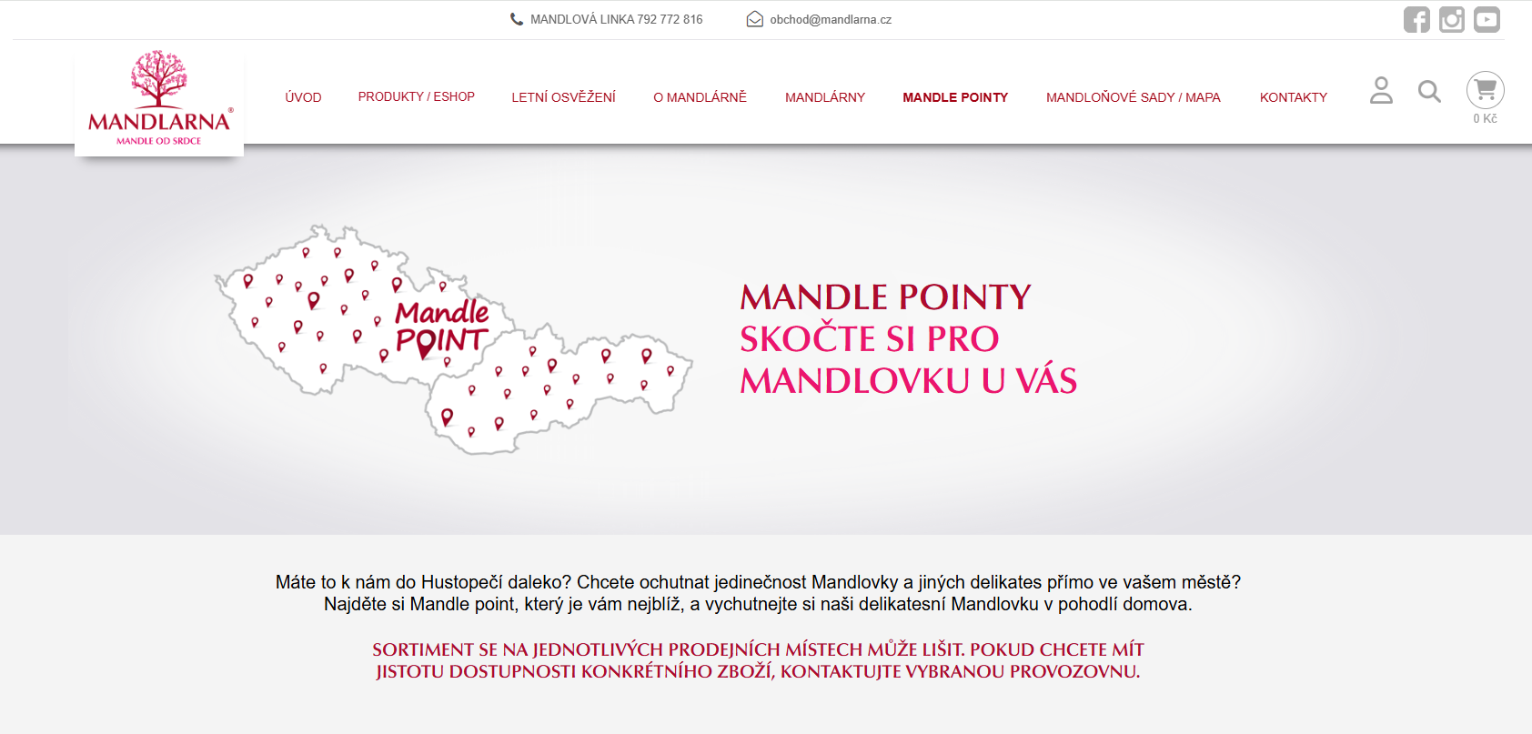
The interactive e-point map — nationwide pickup locations, updated weekly
On the operational side, an API integration with the client's accounting application connected the store directly to their finances and storage tracking, with a live view available right on the website, removing a layer of manual reconciliation that used to sit between online sales and the books.
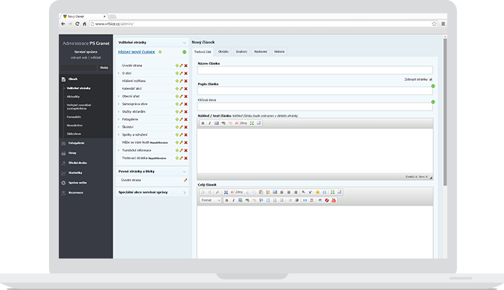
Live financial and storage tracking — connected via API to the client's accounting application
In their own words
"We knew we needed an e-shop to support our product sales, but I never imagined we could go from 0 to 100 so well. The work Petr Kanda did for our online presence resulted in a whopping 75% increase in selling our product."
— Radek Majer, CEO, Mandlárna
What this project reinforced
Talk to the people who absorb customer frustration every day, not just the customers themselves. Two sales reps fielding daily complaints gave sharper insight than a survey alone could have.
Validate qualitative feedback before acting on it. Surveys and verbal complaints pointed at problems; usability testing on the old site is what confirmed which ones were real.
A growth channel doesn't have to be purely digital. The e-point map turned the e-commerce redesign into a nationwide distribution tool, not just a sales page.
A regional producer with strong offline demand and an e-commerce platform built to match it, online sales up 75%, a growing nationwide pickup network, and finances finally tracked in one place instead of reconciled by hand.