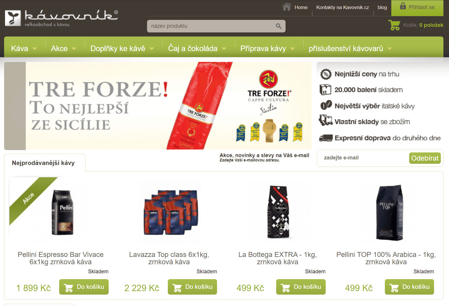
A platform losing sales on mobile, running on a CMS no one supports
Kávovník.cz is a large Czech wholesale e-commerce platform selling coffee from around the world. The client came to our agency with two clear pain points: the site had no mobile version and was visibly losing sales because of it, and the underlying CMS was outdated and no longer supported, making every future change harder and riskier.
The brief was simple to state and hard to deliver: redesign the platform end-to-end and grow sales — not by guessing at what to change.
One-person UX team: research, design, and stakeholder management
I led UX on this project as a solo practitioner, owning both research and design:
Aligning the team before touching a single screen
Before touching any screens, we ran a full-day UX workshop with the client to build a shared understanding of the business: goals, target audience, competitors, current technical constraints, the product itself, key risks, and how success would be measured. The session was captured live in Miro and recorded on video and audio so nothing got lost in translation later.
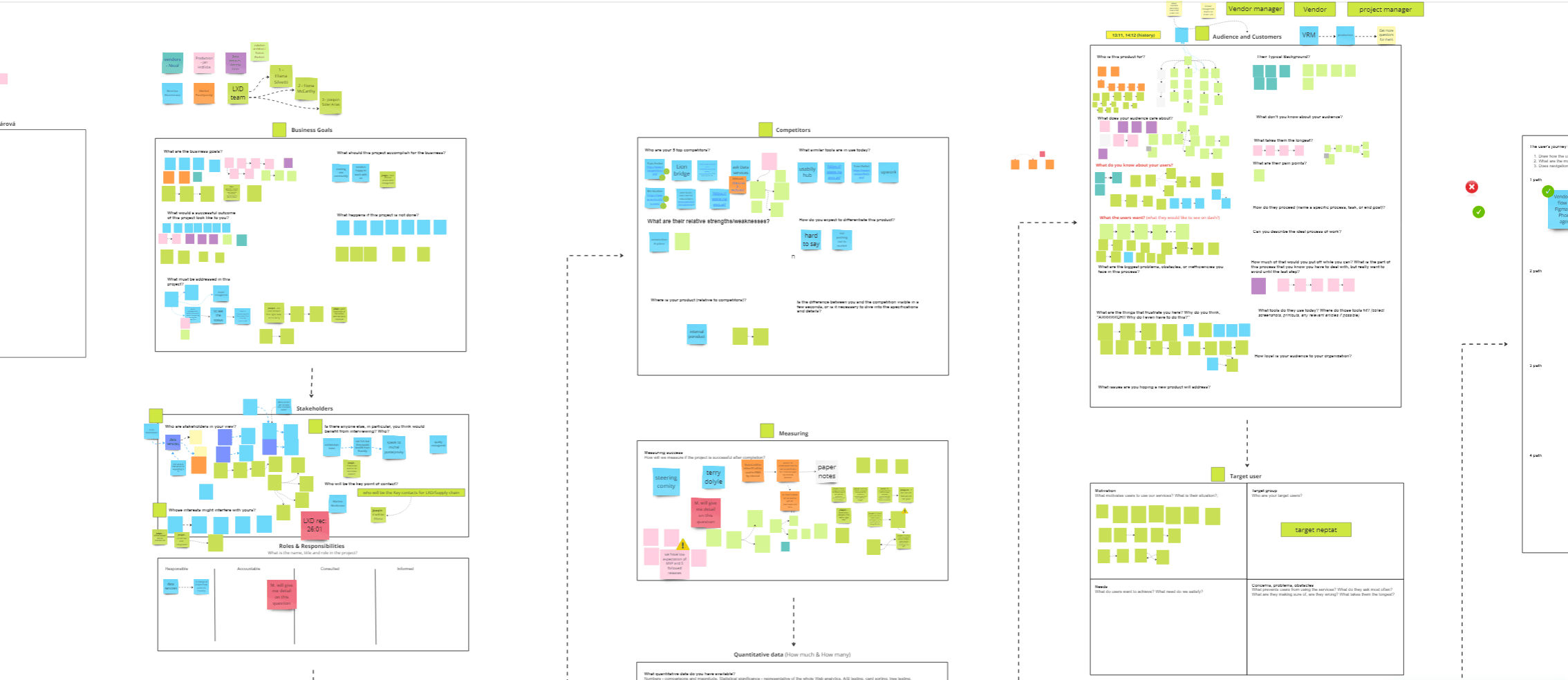
UX workshop canvas mapping business goals, stakeholders, competitors, audience, and success metrics
That workshop surfaced four problems worth investigating properly: lost conversion from the lack of a responsive design, an unsupported legacy CMS, an unclear picture of what users actually wanted, and a client expectation that redesign alone should measurably boost sales.
Five methods, one picture
Based on the workshop, I selected five complementary research methods so no single source of bias could drive the design decisions:
1. Usability testing of the current site
Six participants (one as a pilot) ran through a scripted scenario, each session about an hour long, incentivized at 500 CZK per participant. This is the method I rely on most: it's the one that answers why, not just what.
Key findings: users struggled badly with the lack of a mobile version, search results were poor, navigation logic didn't match their mental model, and they wanted more personalization, repeat-purchase support, a loyalty program, and clearer discount visibility.
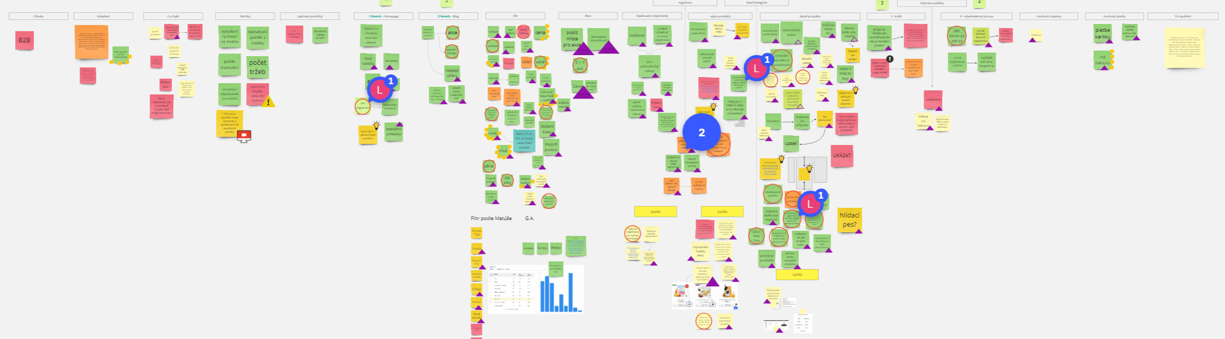
Usability test findings synthesized in Miro
2. Competitor analysis
I reviewed the five competitors the client named during the workshop across product offering, UX/usability, support, strengths/weaknesses, pricing, and technology. Every one of them already had a working mobile experience, clearer product descriptions, better laid-out product pages, easier checkout, and in some cases stronger support — a clear signal of how far behind the current site had fallen.
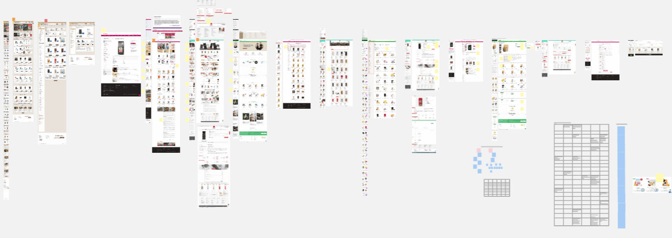
Side-by-side competitor screenshots and comparison table
3. Google Analytics audit
This is where the scale of the mobile problem became impossible to ignore: a 73.04% bounce rate on mobile, search used by only 8.63% of visitors despite most traffic arriving specifically looking for coffee brands, high-traffic blog pages that rarely converted into shop visits, and a steep abandonment rate whenever users tried to complete a purchase on mobile. The primary audience skewed toward women aged 25–34.
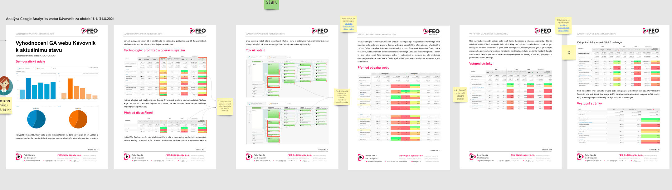
Full Google Analytics audit document shared with the client
4. Hotjar surveys
324 respondents told us directly what mattered to them: shipping satisfaction, likelihood to recommend, what they look for on a product page, what frustrates them, what they love, and how easily they can find what they're looking for.
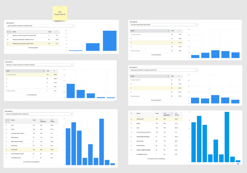
Hotjar survey response data — 324 respondents
Findings reinforced the usability test: the site felt chaotic, every "add to cart" click redirected users away from where they were, there was still no mobile version, and people wanted more detailed product information.
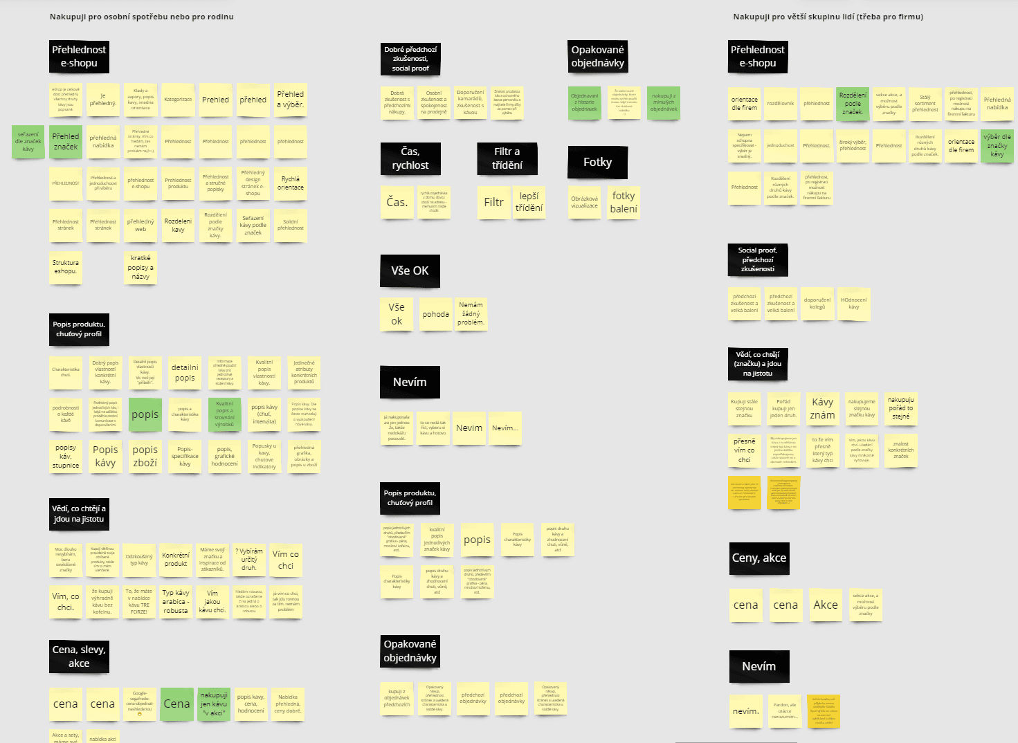
Hotjar findings clustered by theme in Miro
5. Proto-personas
To keep the whole team anchored to real user goals and frustrations throughout design and development, I built two lightweight proto-personas directly from the research data and kept them live in the shared Miro board.
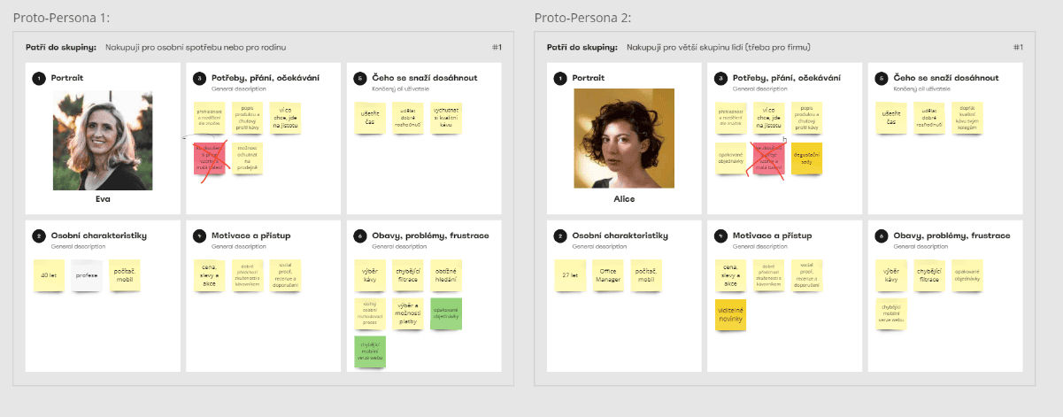
Two proto-personas built from research data
Mobile-first, for a reason
The research gave us a clear mandate: the platform needed a new, maintainable admin panel, a genuine mobile experience, a product overview/detail structure grounded in what we'd learned, and a fully rebuilt cart flow.
I designed mobile-first, deliberately: it's the fastest way to strip a design down to what actually matters before adding desktop-only complexity back in. Wireframes were reviewed continuously with the dev team and the client, then validated with a second round of moderated usability testing (6 new participants, one round only, since that's what the budget allowed).
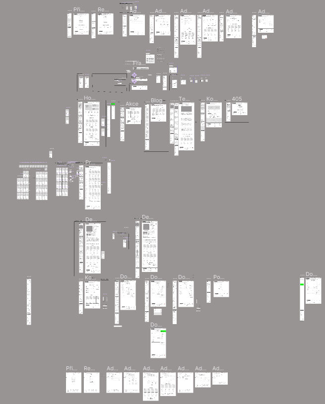
Mobile-first wireframes covering the full site
The result: users moved through the new flows without major blockers, confirming the core information architecture and navigation logic. The mobile experience still needed further iteration, which we flagged clearly for the next stage.
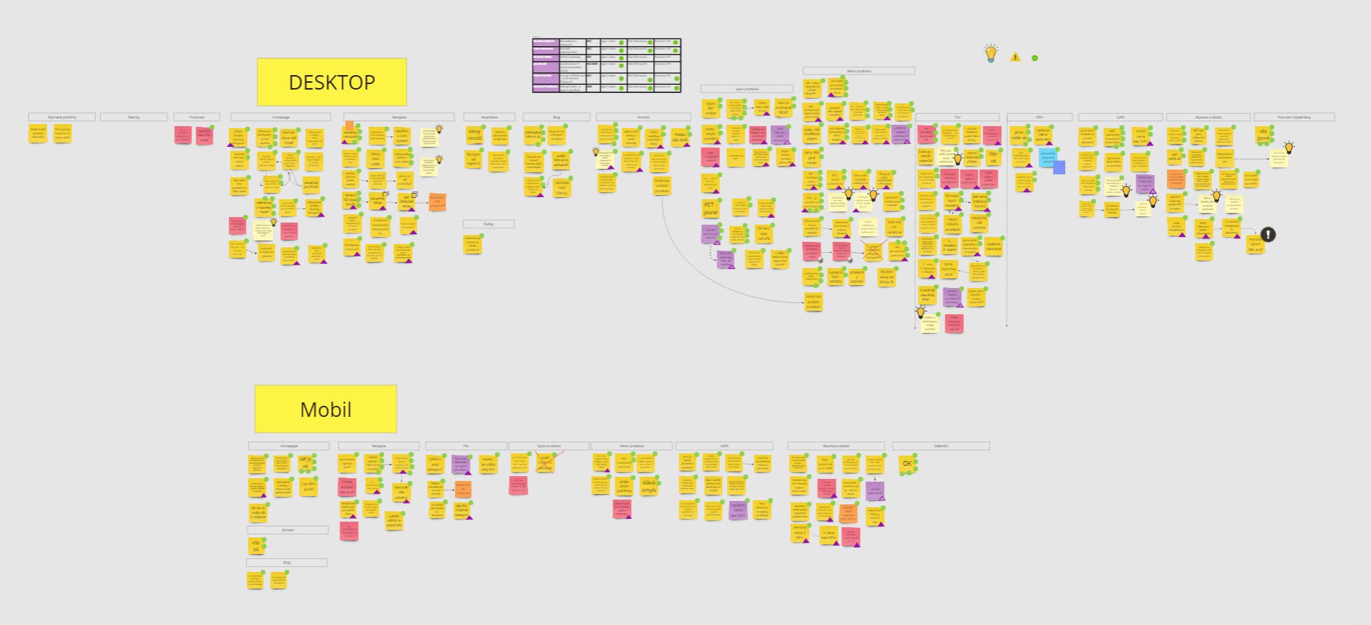
Wireframe usability test results — desktop and mobile — synthesized in Miro
With that validated, the wireframes were handed off for UI design.
Keeping the research intent intact through the visual layer
UI design was handled by an external contractor I worked with closely to keep the research intent intact. He brought genuinely good ideas to the table, but since he joined after the UX phase was already locked, most of those ideas came in too late to validate properly. We incorporated what fit without disrupting the tested flows, and parked the rest as candidates for future A/B testing.
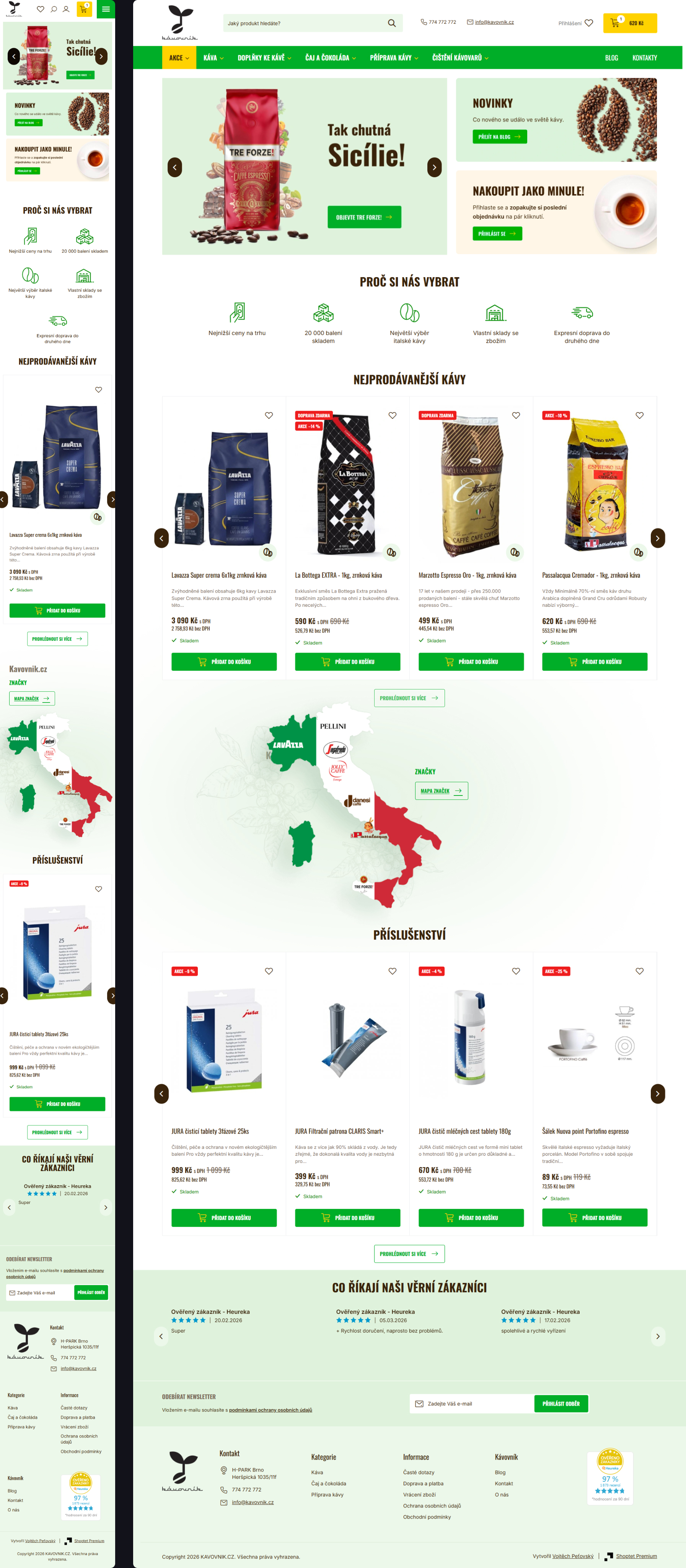
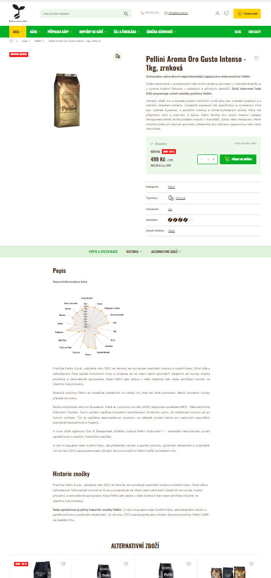
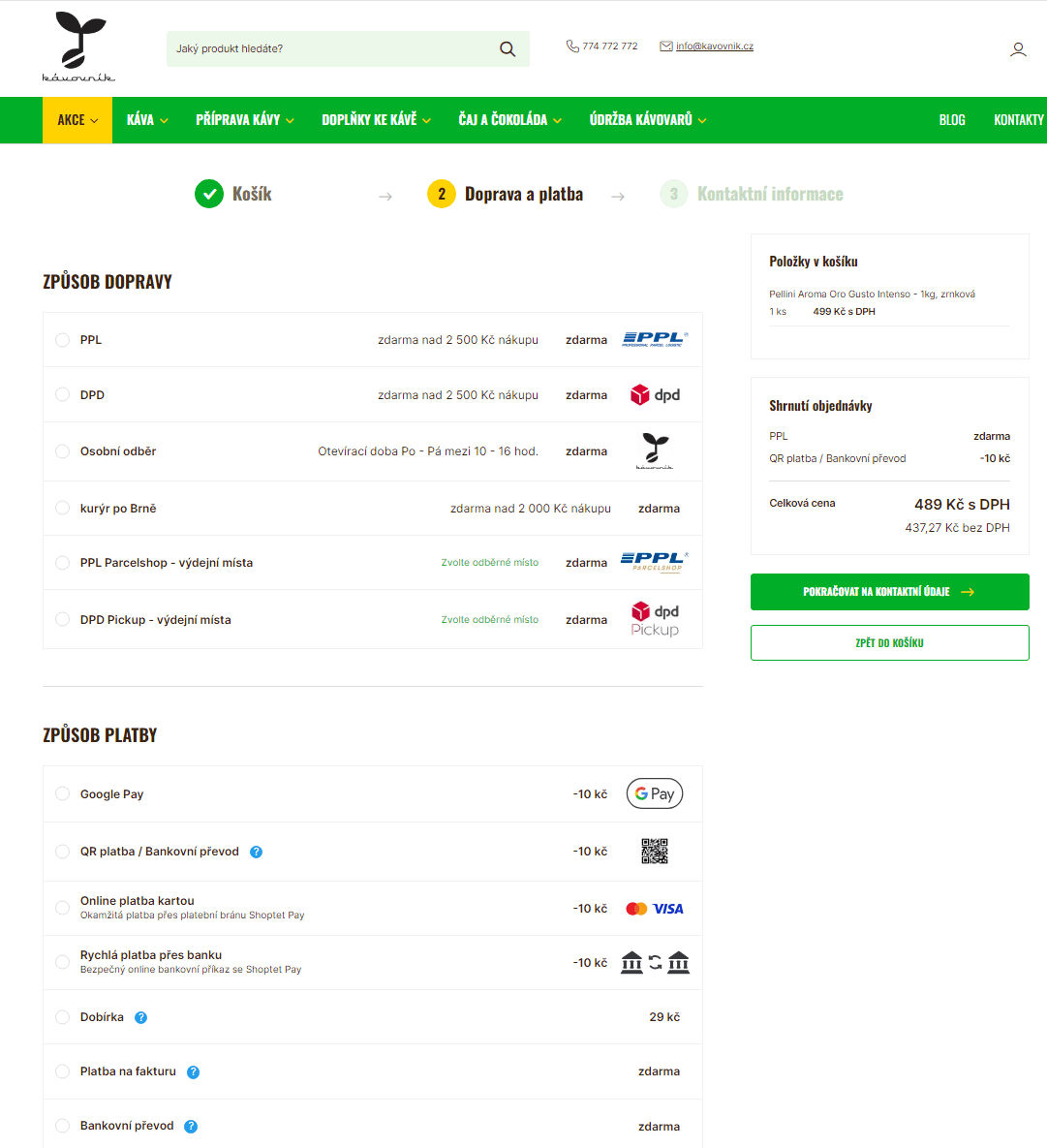
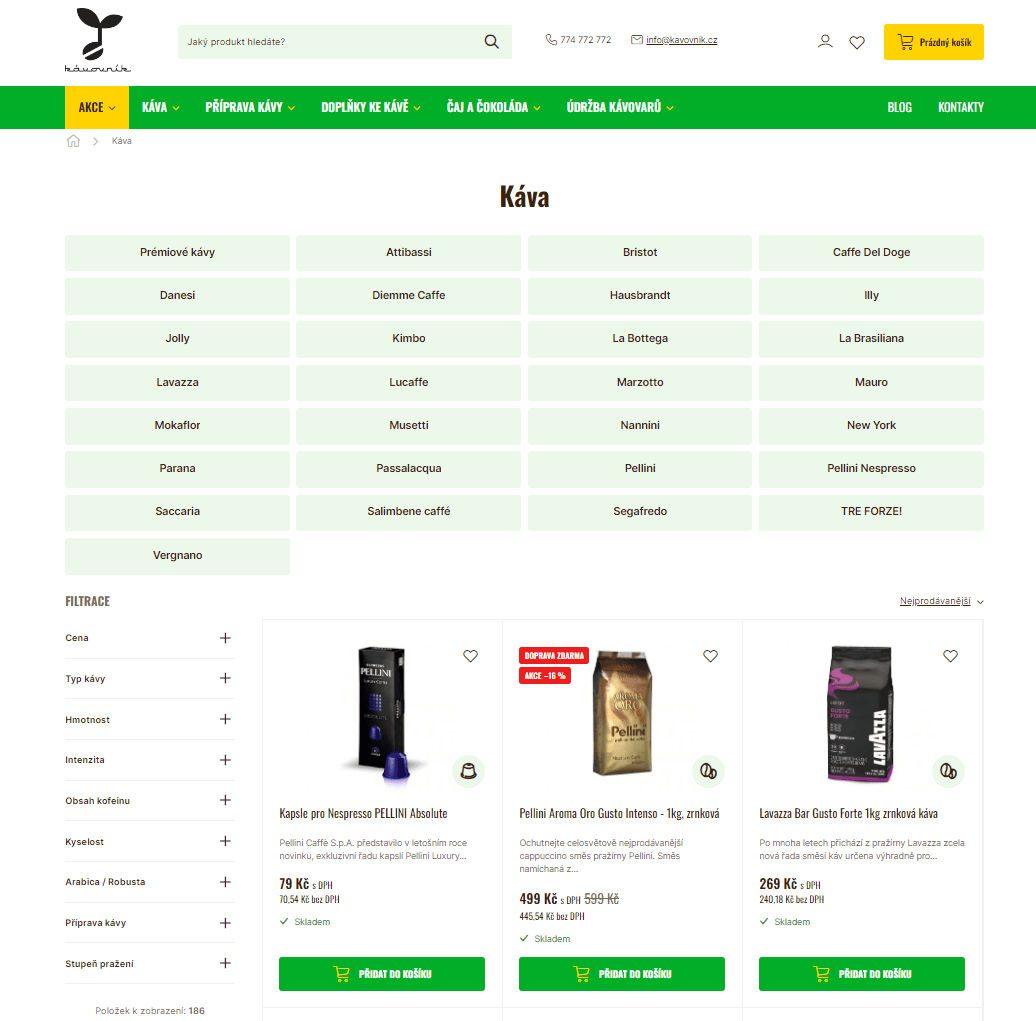
The redesigned kávovník.cz — final UI as shipped
A year and a half, and a baton passed mid-project
Development ran longer than planned (about a year and a half) as the client's decision cycles slowed the pace, and partway through, ownership of the build transitioned to a new project lead as my own engagement on the project ended. The site that ultimately shipped delivers on the core intent of the redesign, though a number of smaller decisions were made after the handoff that I wasn't able to weigh in on.
The numbers after launch
After launch, I followed up with the project's PM to see how the redesign actually performed:
Conversion rate up, driven primarily by the new mobile experience.
Mobile cart abandonment down — from 73.04% to 12.4%.
On-site search usage up — a near-total reversal of a broken discovery experience.
These weren't incremental gains. They're the kind of shift you only get when a fundamentally broken mobile experience gets fixed at the root.
Being honest about the gap
Curiosity got the better of me after launch, so I compared the live site against the original UX intent. Worth being honest about the gap, since it's as instructive as the win:
- Login: no social login (Google/Facebook), as originally recommended
- Blog: no upsell paths added, so it still doesn't convert blog traffic into shop visits
- Product overview: "add to cart" reverted to the old popup pattern; quantity +/− controls were dropped
- Filters: filter order doesn't match what testing showed users actually wanted
- Product detail: layout shifted slightly — description sits under the heading, pushing content further down than intended
- Cart: no way to adjust quantity or remove an item directly in the cart
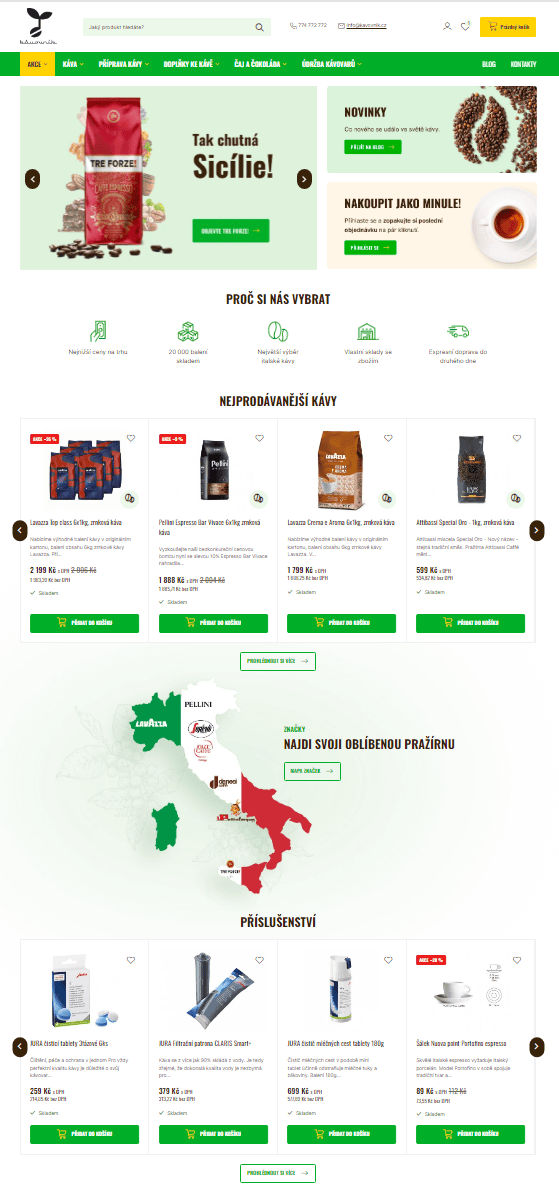
Live homepage
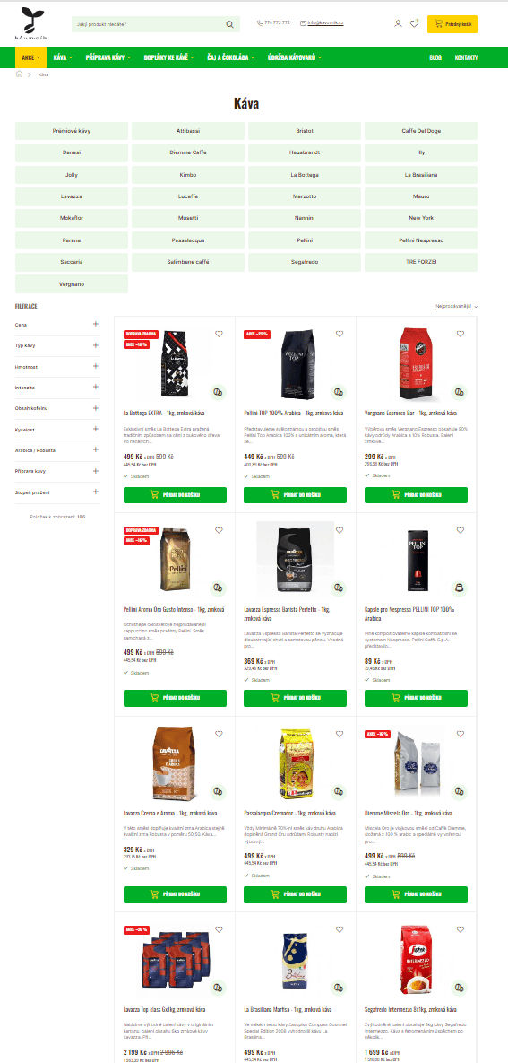
Product detail
Checkout flow
Blog / category page
Shipped product page vs. original wireframe intent
None of this erases the 43% conversion lift. It's a reminder that a design system only holds up as well as the process that ships it.
What I'd do differently
Bring the dev team in from day one. Every assumption about feasibility needs to be tested early, not discovered during the build.
Walk the whole process with the team before kickoff, so there are no surprises about scope or sequencing once work is underway.
Bring UI design in from the start too. Good ideas that arrive late are still good ideas; they just can't always be acted on.
Set concrete milestones with the client. Without them, a project can drift for a year and a half before anyone notices how long it's actually taking.
A reminder that UX work doesn't end at handoff. The most useful thing I did after launch wasn't more research; it was simply checking whether what shipped matched what we'd designed, and being honest about where it didn't.