
Replace the revenue of a store that turned over 600–700K CZK a month — without the in-person expertise that made it work
Intimmo's physical store, known for fitting customers correctly thanks to trained shop assistants, had recently closed. Its e-shop was doing a fraction of that volume (around 10 sales a month) and the business goal was blunt: replace the revenue of a store that turned over 600,000 to 700,000 CZK a month, without the in-person expertise that made it work.
The underlying problem wasn't traffic or pricing. It was trust. Most women get their own bra size wrong, even with a trained eye guiding them in person. Online, with no one to check the fit, that uncertainty turns into hesitation — or into orders that come back as returns.
One-person UX team: research, design, and stakeholder management
I led UX on this project as a solo practitioner:
Five angles, one shared goal
We opened with a full-day workshop to align on the real goal behind the redesign: not just "more sales," but solving the sizing problem at its root so customers would buy once, buy correctly, and come back.
From there, the research plan covered five angles:
Field study
We visited one of the brand's shops and observed, with customer consent, how shop assistants helped people find the right fit in person. It's the kind of detail you can't get from a survey: watching where the friction actually happens.
Competitor analysis
Most competitors relied on static size charts; a few stood out with proper size guides. We also noticed several offered a streamlined one-step checkout for single-item purchases — an idea that later tested well with our own users too.
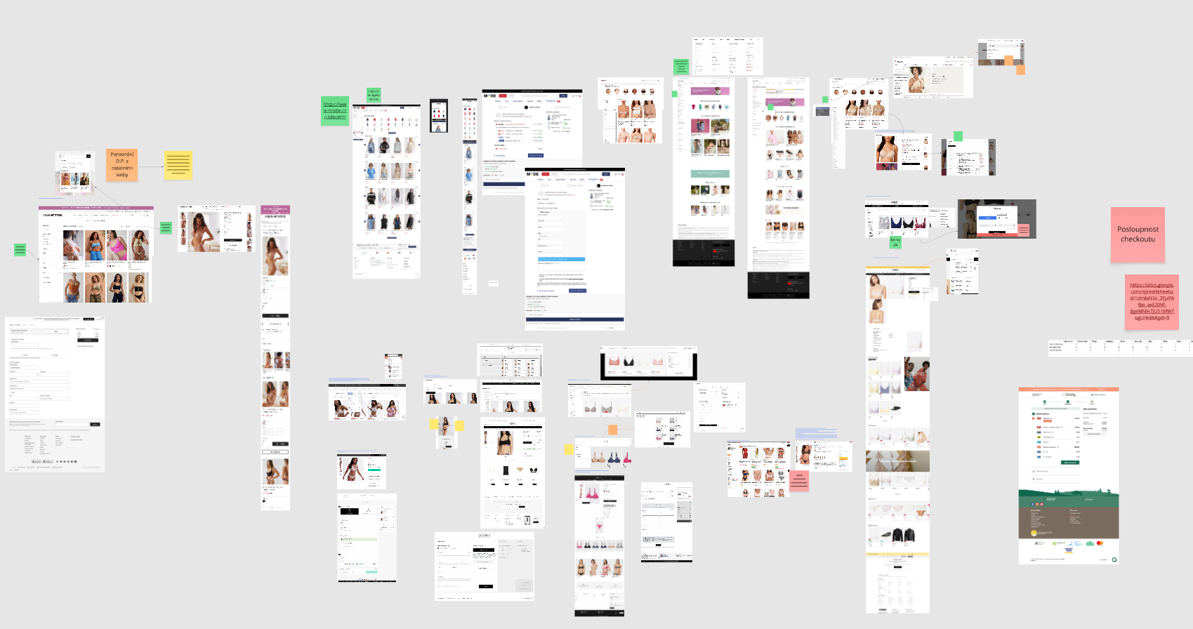
Competitor site comparison — size-chart and checkout approaches
Sizing research
We dug into the sizing systems used across manufacturers, who all label sizes differently, to see whether a single, unified size table was feasible. It was, in principle, but the client's PM chose to hold that idea back as a future paid feature rather than ship it immediately. Not every good idea needs to go out the door on day one.
Usability testing
The client's own site converted too rarely to generate anything useful from testing it directly, so we tested a competitor's site instead with six participants. Only one of the six had used a size-guide feature before, but her conviction was strong: she said she'd never bought the wrong size since. That single data point, combined with the workshop hypothesis, was enough to commit to building a size guide of our own.

Usability testing notes and synthesis from competitor site testing
Analytics
The legacy site's e-commerce tracking had been set up incorrectly, so historical analytics weren't reliable enough to lean on. Worth naming clearly rather than pretending otherwise: this gap shaped how much weight we put on qualitative research versus data for this project.
Connect the shop floor to the website
The shop assistants were already getting sizing right, in person, every time. The idea was simple: capture that moment instead of losing it.
When a customer left the shop with a correctly fitted bra, the assistant would log her size along with a name and email, creating an account on the new e-shop automatically before she even got home — already set up with her correct size. From there, product recommendations could be tailored to fit, and she had every reason to come back online.
For customers who'd never visited a store, we designed a self-service measuring guide that calculated the right size from a few simple inputs, then carried that size through product and product detail pages for the rest of the session. One early assumption we dropped: nobody wants to fill in a long profile about themselves unless the benefit is immediate and obvious. The guide had to feel like a quick tool, not a form.
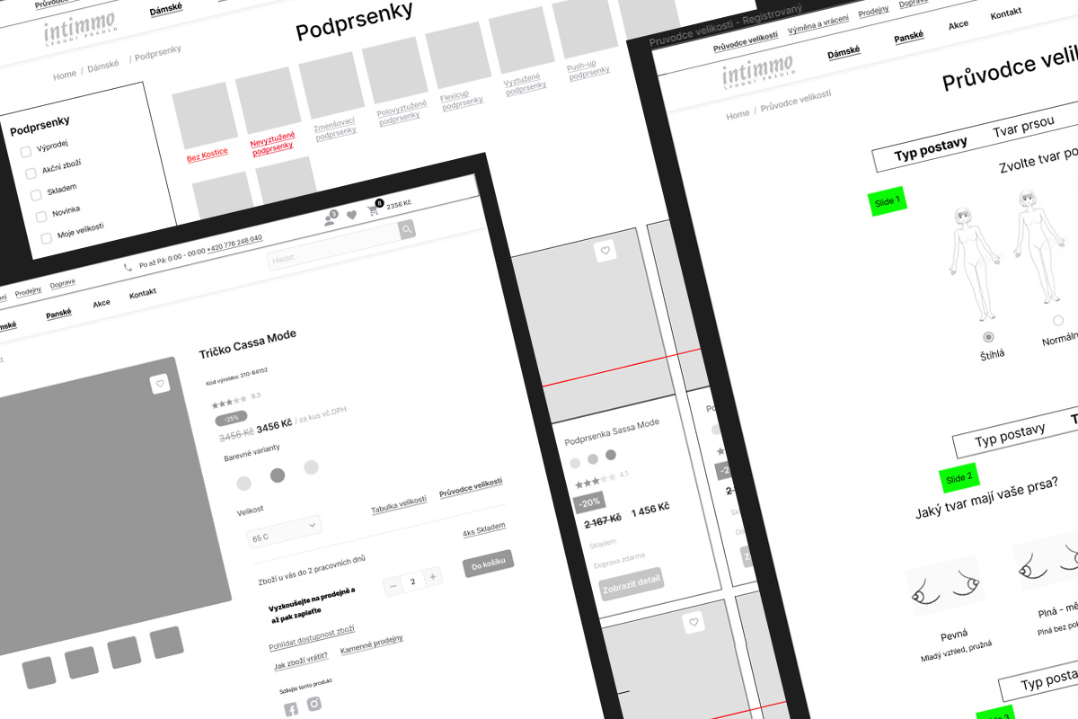
Measuring guide flow — wireframes or UI mockup
Two decisions that came directly out of research
Quick checkout
For customers who already knew exactly what they wanted, we added a one-step "Quick checkout" path, removing every bit of friction between decision and purchase. Testers were explicit about wanting this: pick one thing, pay, and go.
Virtual wallet / store credit
Returns weren't going away — lingerie shopping online always carries some of that risk — so instead of treating returns as a pure loss, we designed a credit system that gave customers money back as store credit. It kept people engaged with the brand instead of just refunded and gone. One tester's reaction summed it up well: it felt like finding money.
Introducing UX to a team that hadn't worked with it before
The client didn't have an established way of working with UX before this project, so part of my role was introducing one: a lighter, iterative approach rather than a rigid waterfall, with research feeding design and design feeding testing in short loops.
It wasn't a perfectly smooth process. Documentation stayed lighter than I'd have liked, and the dev team brought real, sometimes inflexible constraints — particularly around filtering and categorisation logic — that shaped which ideas made it into the final wireframes and which didn't. Some of that friction was just legacy system reality, not disagreement about what users needed.
What did work: the wireframing sessions themselves. Dev sat in on black-and-white wireframe reviews and flagged technical constraints early, before they became expensive problems later.
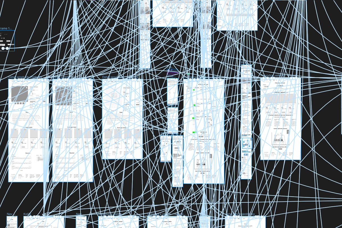
Wireframe review session — black-and-white wireframes
Strong visual ideas, arriving late
The wireframes went through a single full iteration before handing off to an external UI designer, who brought strong visual ideas to a project that, by then, was already largely locked in scope. As with other projects in this portfolio, the pattern repeats: the earlier a UI designer joins, the more of their thinking makes it into the final product.
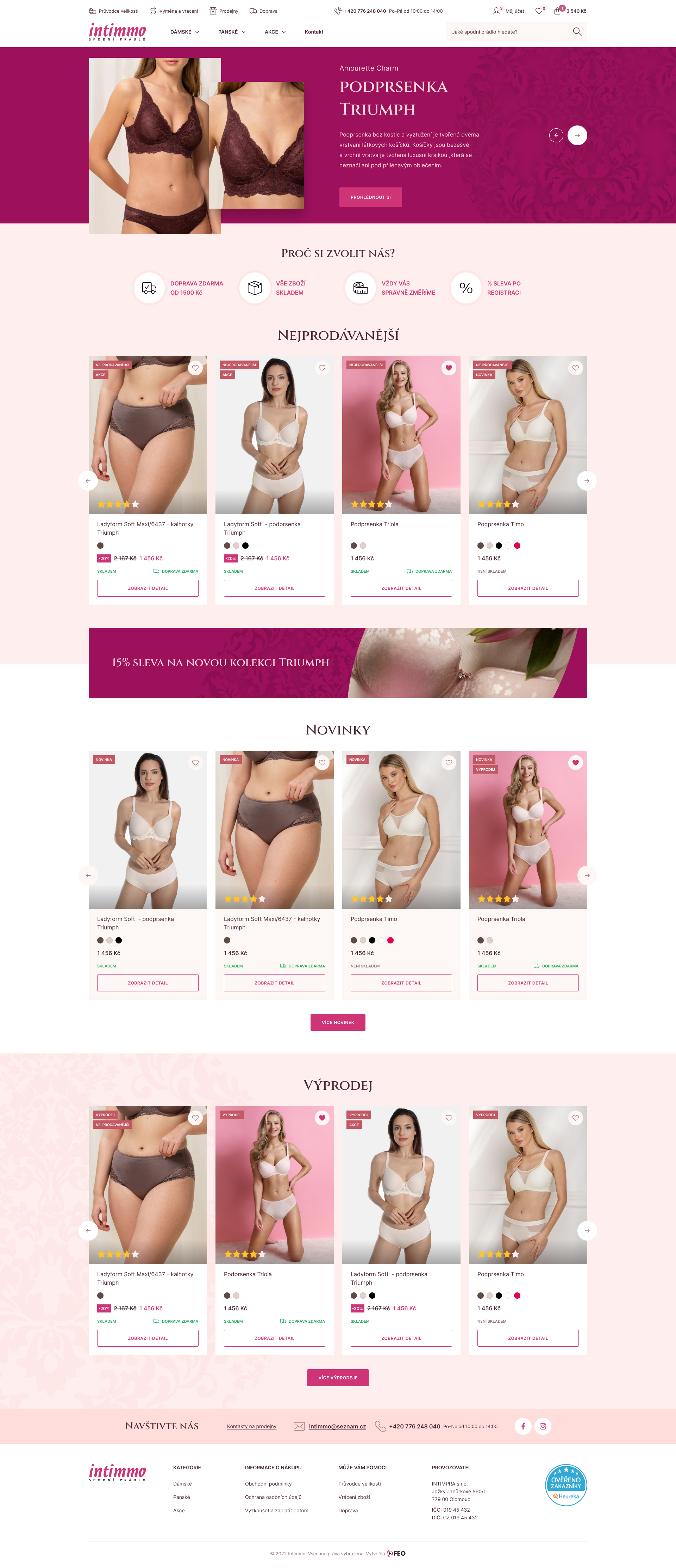
Final UI design — desktop and mobile views
Leaving the team set up to keep going
My engagement ended before the new e-shop launched. Before leaving, I made sure the client had what they needed to keep going without me:
I wasn't able to follow up after launch the way I did on later projects, so I can't independently confirm how the live site performed.
Solving the actual blocker
Sales increase after launch.
The redesign tackled the actual blocker to buying lingerie online (not knowing your size) at its root, by capturing sizing data at the one moment it was most reliable: in the shop, with a trained assistant. Most of the core UX decisions — the size guide, quick checkout, and the account-on-arrival flow — made it through to the final UI design.
What I'd do differently
Don't assume people will fill in a profile voluntarily. They will if the immediate benefit is obvious; otherwise, capture the data at the moment it's already being created — in this case, at the till, not in a form.
A single, convincing data point can be enough to commit to an idea, if it lines up with a hypothesis you already had reason to believe.
Bring UI design in from the start. This is the second project in this portfolio where a UI designer joined after the UX phase was already locked, and the second time it limited how much of their thinking made it into the final product.
When a client has no existing UX process, introducing one is part of the job — but expect to compromise on documentation and process purity in exchange for actually shipping something.
A reminder that not every project ends with a tidy after-launch number. Sometimes the job is making sure the right decisions are in place and the team has what it needs to carry them forward, even after you've moved on to something else.